


|
|
|
An assessment of the most advantageous methodologies to apply to the conceptualisation, design, production and dissemination of a cornucopia of printed matter with a view to maximising and enhancing impact upon recipients, taking into account the concrete and abstract elements of modern typographic design.
| Topic | Section |
| Contents | 2 |
| Introduction | 3 |
| Good practice check list | 4 |
| Bad practice check list | 5 |
| Type face | 6 |
| Type size | 6 |
| Type weight / contrast | 7 |
| Italic type | 7 |
| Capital letters | 8 |
| Numbers | 8 |
| Space between lines | 9 |
| Line length | 9 |
| Line endings | 9 |
| Aligning text | 9 |
| Word spacing | 10 |
| Paragraphs | 10 |
| Headings | 10 |
| Design and layout | 11 |
| Forms | 11 |
| Paper | 11 |
| Colour | 12 |
| Jargon | 13 |
| Language | 14 |
Much of the paperwork currently produced by otherwise skilled teachers discriminates against many of their readers, either through it's wording or the way in which it is presented. Documents are usually created by authors who know their subjects and, as with the famous instructions for the video recorder, they may be far harder to interpret than the authors anticipated.
Few teachers would create a document printed using tiny letters in pale yellow on a bright yellow background because it would obviously be challenging for clients with visual impairment. The unintentional use of long or complicated sentences, full of jargon and abbreviations, is just as disabling to clients with literacy problems, but is often overlooked.
This guide is intended to offer advice and suggestions based on the current best practice identified by leading bodies. It will help you avoid discriminatory practices and make your paperwork accessible to as many people as possible.
Adopting these guidelines for all paperwork, whether it is for your web site readers or for use with traditional printed material, may mean that some changes will need to be made to your existing documents, but the most important thing is to ensure that all new paperwork and writing follows these guidelines.
If you want a ‘quick fix’ to an issue you can use the two check list sheets shown below. Note the different appearance of the two lists and the ease with which you can refer back to any particular item in each list.
If you want to know a little more detail, each topic is covered in greater depth in the main section.
Use clear sans-serif fonts such as Arial or Helvetica;
Use a minimum size of 12pt;
Use italics only to highlight words or phrases;
Use lower case letters in sentences;
Keep sentences short;
Use simple and uncomplicated language;
Use a font with clear numbers and a hooked 1;
Leave even spaces between words;
Leave good spaces between lines of text;
Leave good size margins;
Keep the length of lines down to 50 – 70 characters;
Switch off automatic hyphenation on the computer;
Leave several blank lines between paragraphs;
Leave space around headings to make them more visible;
Use a simple and clean layout;
Use good size boxes / larger than normal tick boxes on forms;
Use lightly tinted paper;
Use paper with a matt finish;
Use high contrast colour schemes;
Provide a contents list or similar if the document is complicated.
Check list: Bad practice can be avoided if you…
Don’t use unusual, script or fancy fonts;
Don’t use serif fonts (fonts with fancy twirls and lines);
Don’t use font sizes smaller than 12 pt;
Don’t rely on using ‘bold’ to make things clearer;
Don’t use all capital letters, even for titles;
Don’t use fonts with numbers that can be confusing;
Don’t leave tiny spaces between words and lines of text;
Don’t use very long lines of text;
Don’t use full justification on text;
Don’t type right up to the margins of the page;
Don’t split words using hyphens unless it is vital to do so;
Don’t merge headings into the body text;
Don’t use complicated multi-column layouts;
Don’t use forms with small boxes for written comments;
Don’t use dark coloured paper with dark print;
Don’t use bright white paper;
Don’t use glossy paper;
Don’t use low contrast schemes where the text doesn’t stand out from the background;
Don’t print over complicated background images – keep it plain.
Quirky, unusual, and fancy font types are obviously inappropriate for continuous passages of legible text. These types of font, including the popular Times New Roman, should be avoided unless used for special reasons. If they are used for headings and highlighting, you must make sure that the text remains easy to read.
Use a sans-serif typeface such as Arial or Helvetica when producing documents. This makes life much easier for the partially sighted because the letters are not decorated with fancy twirls and lines.
The choice of typeface is less important than contrast, type size, weight and the spacing of characters.
Using bold or italic does not always make a difficult to read typeface any easier to read; it makes Brushscript and Baskerville much harder to read, as you can see in the examples below.
| This is Arial | This is Arial | This is Arial |
| This is Brushscript | This is Brushscript | This is Brushscript |
| Times New Roman | Times New Roman | Times New Roman |
| This is Baskerville | This is Baskerville | This is Baskerville |
For the partially sighted, 14pt type (average x-height of 2.5mm) is suggested as a minimum by the RNIB (Royal National Institute for the Blind). Some visually impaired readers may need documents in 16pt type, but there is no benefit from using a type size larger than 20pt.
The RNIB recommends the use of 12pt type and you should adopt 12pt as the standard for all documents you produce. Remember though, that different typefaces with the same ‘point size’ may actually print at different sizes. Times New Roman will always looksmaller than Arial at the same point size.
| Font Size 0 | Times New Roman | Arial Font |
| Font Size +1 | Times New Roman | Arial Font |
The tendency has been to use text in bold because of its contrast on a white page. However, more recent findings suggest that a medium weight or semi-bold may be more legible. A good contrast between page and print can be obtained by using slightly tinted paper as well as by changing the weight of the type. Many partly sighted people find light letters on a dark background easier to read than dark letters on a light background.
|
Poor Contrast |
Good Contrast |
Italic type should not be used for continuous text. It can be used as a way to emphasise important words or phrases, especially if the body text is already in a semi-bold typeface and a change to bold may not standout very well. The titles of books, etc. should still be italicised.
E.g.
“According to the DfEE ( How to get a Job, HMSO, 1997 ) life has never been easier.”
Italic versions of most serif fonts are difficult for visually impaired readers. Italic versions of sans-serif fonts are normally just sloped versions of the normal (or roman) font and should be much easier to read.
Serif font | Make it harder for visually impared readers |
| Sans serif font |
Make it easier for visually impared readers |
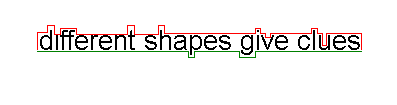
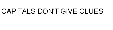
TEXT IN ALL CAPITALS IS MUCH HARDER TO READ THAN NORMAL-CASE CONTINUOUS TEXT.
Capital letters are all the same height, and often of similar widths. Visually impaired and normally sighted readers all use the different shapes of lower case letters to help work out which letters they are reading – using just capitals removes these useful shape clues.
One or two words set in capitals does not create reading problems. Capital letters are easier to see than lower-case letters, so they may be suitable for labels, short titles etc.
 |
 |
It is important that numbers are made as clear as possible. This is particularly important for stores invoices and any maths / science work we may set. Some typefaces have figures that are easily misread. The numbers 3,5 and 8, as well as 0 and 6 can be easily confused. The number '1' can be confused with I (L), and l ( i ) and even !
A 'hooked' number one is much clearer than a straight vertical stroke. The Arial version of 1 is hooked. Choose a typeface with distinctive numbers.
Leave reasonable space between lines of type. Make sure that the tails of one row of typing don’t meet the up strokes of the line below. There must be a good clear space between them. Long lines of text need more interlinear space than text set in short lines.
To change the space between lines (MS Word):
Format => Paragraph, then click the Indents and Spacing tab. Select an option from the Line Spacing box.
This should ideally be in the range of 50-65 characters. Some visually impaired people may prefer even shorter lines, but 50 to 65 characters will normally be all right.
MS Word will allow roughly 64 characters per line in the default setup using Arial 12pt text, so you probably won’t need to alter the width of the standard template on your computer. When creating documents as web pages it is much harder to control line length. Use Tables to set out important text and make good use of the line breaks (<br>) and paragraphs (<p>) to force the web browser to end lines.
Avoid splitting words at the ends of lines by using hyphens. When using MS Word, the easiest way to do this is to switch off the hyphenation option.
Go to Tools => Language => Hyphenation and make sure Automatically hyphenate is not ticked.
Use unjustified, ragged right, text setting with even word spacing. Do not justify text so you have straight edges on both sides of the page: this creates uneven word spaces and makes the text harder to read. Many poor readers find fully justified text hard to read, especially when working with poor lighting.
|
Fully justified text, especially when it includes long words like dendrochronology, results in different size gaps between words. Brobdingnagian, psychoanalysis, contemporaneously, collaborationist, ecclesiastically and tenderheartedness also mess up full justification. |
Always use even spacing between words. Some documents for the visually impaired are produced using double word spacing. This might help some readers; others may find double word spacing actually makes things worse. Don’t use it in general documents but be willing to try it if a reader thinks it will help.
It is difficult and inconvenient to use double word spacing on a web page, so the correct choice of layout, font size and style is all the more important..
Leave space between paragraphs. There should be more space between paragraphs than between lines of text.
Other ways of starting paragraphs such as indenting the first line, out-denting the first line, using a bullet or asterisk, may make text harder to read for visually impaired readers. Use these techniques only when they are appropriate, such as in lists, curriculum vitae, etc.
Headings should be clearly different from the main text. Don’t use just capital letters. Headings in bold are clear as long as there is plenty of contrast between the weight of the heading and that of the text. Try using a different type size, a different font or different colour.
Extra space around headings is a good way to separate them from main text.
There is no evidence to show that underlining headings makes them easier or harder to read. When creating a CV, don’t underline anything unless you really have to. Many companies use computer scanners to record details from CV’s, and underlining can create errors in the scanning.
FANCY HEADINGS IN ALL CAPITALS CAN BE DIFFICULT TO READ Especially if they are not separated from the rest of the text in your document
Layouts should be simple and clear. Stick with the same system throughout a document for headings and sub-headings, numbering systems, and treatment of specific information (e.g. references). Wide margins around pages of text make reading easier by drawing the eye into the page, not off it.
If text is set in columns make sure there is space between them. If space is limited, use a vertical rule. If you use a complicated layout, include a contents list (especially for multi-page documents) or another navigation guide. Bullets can be used with lists and key points.
|
Text presented in lots of narrow columns can be very difficult to |
understand because it doesn’t scan across the page |
in the way we expect it to. If you have to use columns it is a |
good idea to insert vertical rules between each column. |
One document can look much like any other if you can’t read it easily. To make important documents look distinctive, try using distinctive colours, sizes and formats on the covers / first pages to make each document stand out from the crowd.
On written forms, visually impaired people often need larger than normal spaces to fill in hand-written details. Their handwriting tends to be larger than average. Other people may have physical problems that make it hard to write neatly, so they too need more widely spaced lines or larger boxes. This also applies to tick boxes, which should be about 50% larger than their standard size if the form is to be used by visually impaired people.
When creating forms on a web page, ensure that the answer boxes are large enough to allow users to see what they have written. Small boxes that prevent the user from seeing whole words as they type them are very bad practice. If space allows, create boxes that show the entire answer as it is typed.
Glossy and bright white paper should not be used because of problems with glare. Lightly tinted paper may be used, but always make sure that there is a good contrast between the paper and the type colour.
Avoid using paper with patterned surfaces, mottled flecks and similar fancy surfaces. The patterns can cause confusion for visually impaired readers who find it hard to separate the text from the background.
The human eye can see 7,000,000 colours, some of which are pleasing whilst others are real eyesores. The wrong colour combinations can make reading very difficult, cause headaches, nausea and eyestrain.
Good use of colour maximises productivity, reduces stress and promotes learning.
|
Bright lemon yellow is the worst colour to use. It reflects far too much light and irritates the eyes. In fact, research shows that babies cry most in yellow rooms, and domestic violence occurs most in yellow rooms! On the other hand, because bright yellow is the most visible colour of all, you can use it to get attention. It is ideal for signs with contrasting black letters. Softer shades of yellow are good backgrounds for printed material because they are warm colours that contrast well with dark print.
|
Avoid red backgrounds for two reasons. Firstly red does not contrast well with black – the only printing colour you’ve got on most printers.
Secondly, of the 250,000 colour decoding sensors in your eye, 83,000 of them are looking for red. Staring at a red background over stimulates the eyes and makes the opposite cones kick into action. The results can be un-nerving!
|
· |
· |
Stare hard at the dot in the red box for 30 seconds, and then focus hard on the dot in the white box. Did you see something odd?
You probably saw an after image, a bluish green hue instead of white paper. Excessive exposure to effects like this will cause eyestrain and headaches.
The ‘after image’ effect will happen if you stare at any bright colour for too long, so stick to backgrounds using subtle shades of light colours.
Avoid bright white paper whenever possible. The black and white contrast can too strong for some people, especially in bright lighting conditions. The eye muscles have to work too hard, especially when glare increases the overload on the eyes, and this leads to eye strain and headaches. Use a light colour paper such as pale blue when you can and, if you have to use white, make sure it does not have a glossy surface.
People often find that the unexplained use of jargon and abbreviations leaves them confused and missing key information. Some people in the know just LOL (Laugh out loud) at this, but others end up wondering WTHWTA (What the hell was that about)?
Always remember that even though you know what you mean, others won’t automatically have the same understanding. Explain all jargon and acronyms the first time they are used, or in a table somewhere near the front of your document.
So remember, WYSIWYG, and if you only see something you don’t understand, you won’t get it.
As the title of this guide illustrates, there are different ways to say the same thing. Generally, you need to keep sentences short, direct and to the point. Long sentences are much harder to read than short ones. Make good use of full stops.
Avoid lengthy lists of ideas strung together with commas, because that sort of thing is fine if you are talking to somebody, but when you write it down, things look very different, and some people, especially with reading difficulties, or poor sight, or who are tired, irritated or in a hurry, will find it very difficult to read what you wrote, and at the very best may well have forgotten what the start of the sentence was all about by the time they get to the end of it, and will have to start all over again and thus become even more frustrated and annoyed.
Don’t use lengthy or rarely used words when a commonly used and easily understood one is available. For example, we don’t refer to public transport as omnibuses in general conversation, so don’t write it – stick with bus.
The language you use should match the audience, although the rules of grammar and spelling should still be observed unless they complicate issues too much.
If you want to check the reading ease of a document you have produced, Word for Windows includes a checking program to calculate Flesch Reading Ease values. A value of 60 to 70 should be the target minimum value for documents distributed to clients.
Tools => Options => Spelling and Grammar. Select the Check grammar with spelling box, select Show readability statistics box, then click OK. Click the spelling button ( ABC and a tick) on the document page to perform the check.
So, when you create a new document, remember... 1. Each of us has a different ability to write, to read and to understand. When you create a document for others to read and understand, you should make every effort to make the reader's task as easy as possible. 2. Use a san-serif font that can be read even if your audience have some sight problems. 3. Improve the ease of understanding by keeping sentences short and to the point. 4. Give as much thought to design and layout as you do to content. Even the very best content is useless if your audience cannot read it! |
![]()
We value
your ideas and suggestions. Please contact the
maintainer of this site.
This page
can be found at: http://www.geography-site.co.uk
Last
update to this statement was on: 8th April 2003
© Copyright Geography Site